Creating graphs.
We have already drawn several bar graphs by hand. But graphs can also be created in a spreadsheet. We only need a statistical serie. You are going to work with the one you made by using the age of your classmates.
Specifically, you are going to represent in a bar graph the age in months of all the students in our class.
To do so, open the "INSERT" menu ("insertar") and select "CHART" ( "gráfico"):

You will see the following screen:

Just follow the steps given by the graph assistant.First, select the data range, that is, the data you want to show in your graph.

In "data range" click on the balloon and in the spreadsheet you have to select all the cells of the sheet containing data.
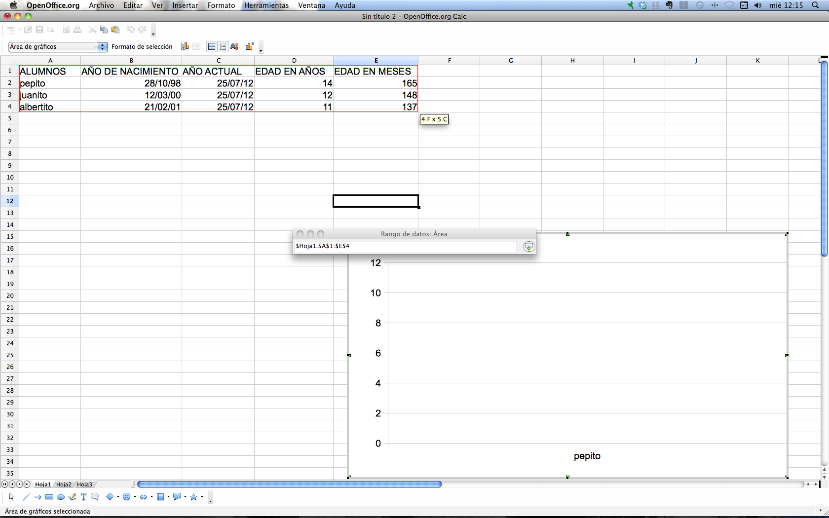
Press INTRO and the following graph will be created automatically:

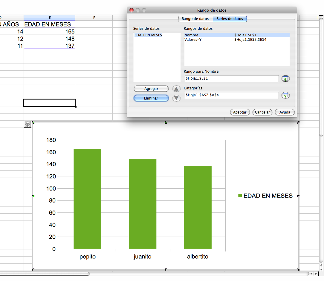
Go to "data series" and leave out the series you are not interested in, choosing only "age in months".

Click on ACCEPT and that's it!
If you want to improve the graph, you may also place the pointer on the chart, press the left mouse button and you will be able to add titles, change colours, etc.